When to Use a Pareto Chart - Examples and Guidelines
A Brief Introduction
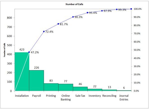
Pareto charts have been used in project management, especially Six Sigma, as a useful tool. The Pareto chart shows vertical bars (in descending order) and a line chart depicting the cumulative totals of categories. Pareto charts can be easily created in Microsoft Excel.
Generally, Pareto charts are an important tool used in quality management - but when are you supposed to use them? There are at least four instances when creating a Pareto chart is advisable:
- To analyze the frequency of defects in a process
- To look at causes in a process
- To figure out what the most significant problem in a process is
- To communicate data with others
Analysis of Process Defects
When you want to improve the quality of the product or process, you might create a Pareto Chart. Angela wanted to find out what problems were involved in her company’s customer service process. To do so, first she collected data about the different customer needs and how well the customer felt those needs were met using a survey. Once she had the data in hand, Angela began to arrange the data. Once the data were arranged, Angela listed the categories in order from the highest rate of dissatisfaction to the lowest rate of dissatisfaction and created a bar graph - with the highest rate of dissatisfaction on the left, and the lowest rate on the right. Finally, she plotted the cumulative totals across the graph using a line. Now that the information was in front of her, Angela knew where to start in the quality improvement process.
Looking at Causes in a Process
Amy already knew what problem she had to work on in her quality improvement process, but what she didn’t know was which of the potential causes she should focus on. After conducting a cause analysis and obtaining data, Amy organized her data, put criteria into a Pareto chart format, and was able to see the various causes of the problem - all in one place, from the most common defect cause to the least common defect cause.
Figuring out the Most Significant Problem or Cause
In order to determine what the quality improvement project will be, first you must determine what the most significant problem in a process is. Angela found from her Pareto chart that the most common cause of customer dissatisfaction was long wait times on the technical support line. She then initiated a project to create a more effective call center eliminating longer wait times by having automated responses to frequently asked questions. Amy found that the most common cause of problems in her product was human error. She instituted a change management project focusing on improving employee training and computer skills.
To Communicate Important Data with Others
One of the most common reasons charts are created is the ability to quickly communicate a lot of data with a large group of people. By creating a Pareto chart, you can depict through visual means exactly the problems or problem causes that must be addressed. The intended audience then can glance at the chart and quickly see the most common problems, or the most common causes for problems. That makes it easier to communicate the different projects a company should undertake for quality improvement success.
This post is part of the series: Pareto Charts and Analysis
Looking for tips on how to perform a Pareto analysis or how to create a Pareto chart in Excel? Check out some of the other articles in our Pareto series.