Creating a Spaghetti Chart: Explaining With Examples
What Is a Spaghetti Chart?
A spaghetti chart is a graphical presentation of how information, materials and people move on the actual work floor. This graphical tool offers a lot of help in identifying poorly laid out work or product paths, and thus is often the first choice for lean process improvement.
Spaghetti charts are prepared as a scaled map of the work floor on a standard work sheet. The procedure for drawing spaghetti charts requires the user to observe the work flow, identify work points and use connecting lines to show the process flow. There’s no need for any specialized software, as standard work sheets can be created either as hand-made sketches or using some spreadsheet program such as Microsoft Excel.
Creating a Spaghetti Chart
To make it easier for you to understand how spaghetti charts are made, we’ll explain the procedure with the workflow analysis of a restaurant kitchen, as an example.
Scale the Workplace
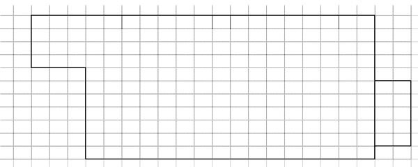
Open an Excel spreadsheet, and adjust its column width so that it equals the row height and we have a standard work sheet made up of squares. Choosing a scale of 1:10 or whatever seems manageable on the spreadsheet, draw the boundaries of the workspace.
Identify Work Points
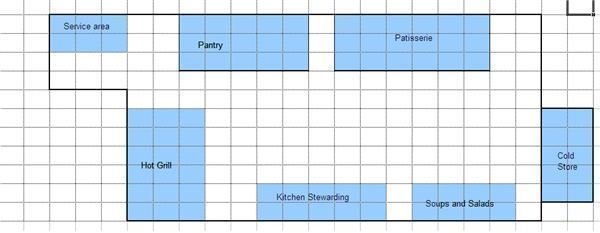
For this and subsequent steps the user will have to closely observe how things have been placed in the workspace and how the information, materials and people move about to accomplish tasks during an average workday. Work points are the key points on the process map, where process activities take place. Once these points have been identified, these points should be marked on the standard work sheet. In our example these key points are - service area, pantry, patisserie, hot grill, kitchen stewarding, cold store and soups and salad prep.
Draw Process Lines
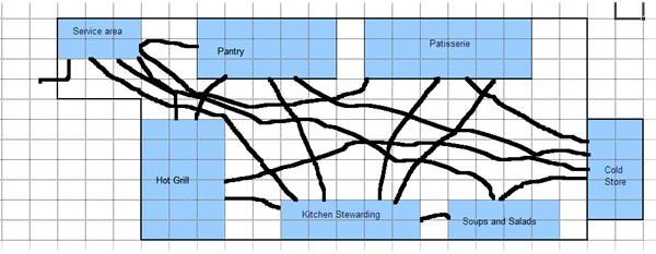
The next step involves detailing how things move with the process, from one point to another. For this, lines can be drawn to link up the work points. The standard worksheet at this stage looks like a bowl of spaghetti, and that’s the reason these process maps are known as spaghetti diagrams. The image below shows how different work points have been linked up in our example of the restaurant kitchen. For instance there is a line to show that the service area receives the order ticket from the restaurant, and then there are lines showing how this order is distributed over to the different sections of the kitchen.
The procedure of drawing spaghetti charts ends here, but the more important job of analyzing the process map and streamlining the processes to optimize the output begins from hereon.
A Lean Manufacturing Tool
Spaghetti charts help identify problems in the work process. The two key types of problems brought out by spaghetti charts are wastage points and weak product or work paths. Areas on the spaghetti chart where work paths look jumbled up are the areas which need to be realigned and reorganized. With the problems identified, it becomes easier to bring in lean manufacturing process improvements by reorganizing the work points and work paths.
References:
- https://www.gembapantarei.com/2008/02/101_kaizen_templates_spaghetti_diagram.html
- https://www.howtodothings.com/how-to-spaghetti-diagram-for-a-lean-process
- https://www.systems2win.com/solutions/layout.htm
Image Credit: All Images by Sidharth Thakur.