Understanding the Ins and Outs of Control Charts, Lingo and Application
Why Data Measurements Matter
Project management thrives on statistics. Change without data analysis is virtually impossible – and impractical. Learning from the problems of past projects enhances the manager’s likelihood to not repeat mistakes, missteps and false assumptions. Suitable measurement tools include control charts, which allow for recording and analysis of data pertaining to variations, defects and processes. Yet far too often, a project manager gets comfortable with a set of charts, even if they only marginally pertain to a project at hand.
Avoid the Siren’s song of using charts that do not fully allow for statistics gathering in your particular situation. Moreover, do not allow project management lingo to scare you away from looking to more specialized control charts when planning a new project. In fact, there is a good chance that the more intricate charts are merely a specialized version of a familiar base chart.
Proper application of control charts has the power to highlight adherences and fluctuations for the duration of a project. Such measurements offer the manager an opportunity for course adjustments if needed; at the same time, the data has the advantage that it provides valuable hindsight facts and figures for future endeavors. Of course, these invaluable statistics only yield benefits if the charts are used to their fullest extents possible.
Basic Chart Usage and Tips for Application
Introduction to Control Charts: What They Are; How They Are Used
Six Sigma would be impossible without control charts. Do not allow acronyms and detailed breakdowns to scare you away. The differences between charts are frequently subtle but well-defined for the project manager in the know to discard quickly one model in favor of a different one.
Introduction to the Six Sigma DMAIC Process: The 5 Phases of DMAIC
The DMAIC process is an integral aspect of Six Sigma. It denotes five key-components that present guideposts for data documentation. Charting this data is part of a project manager’s job description. Here is a look at the process and some tools for your resource toolbox.
Six Sigma is a business stratagem that dates back to the early days of Motorola. It allows for superior data mapping and metrics tracking. Six Sigma templates make the creation of charts easy and quick, as you will discover as you explore the information presented here.
Understanding Histograms: When to Use Them
Data analysis frequently benefits from the judicious use of histograms. As data presentation tools, they augment charts. This is especially useful within a presentation or as part of a post-project analysis. This article gives you a better understanding of their value and the process.
Another type of data presentation chart is the RACI matrix. It deals primarily with project team member participation. For the project manager who must ensure that personnel accountability is accounted for in a control chart, this matrix is of vital importance.
As you have already noticed, project management is a field that thrives on insider lingo. This is generally considered to be a negative attribute within the business community, but in this instance, it is of vital necessity. Learn to differentiate your SIPOC from a PERT.
<strong>What Is a Work Breakdown Structure?</strong>
Within the theoretical models that serve as backdrops to most – if not all – control chart setups, overlaps are frequent. To keep confusion to a minimum and ensure that all project participants are indeed on the same page, clear definition of paradigms is an essential element of communication. Part and parcel of this approach is an understanding of the WBS.
<strong>The Difference between 2 Sigma vs. 3 Sigma Control Charts</strong>
Multiple control chart options necessitate an easy to define and differentiate language. Unfortunately, it makes it difficult for outsiders and novices to kept track. If you are just starting out in the world of project management, brush up on the lingo and know your 2 Sigma from a 3 Sigma.
<strong>An Analysis of the Relationship between CMMI vs. Six Sigma</strong>
The advantage of digging deeper into the finer differences between control charts is readily available, as you notice the subtle differences between data measurements and interpretation models. CMMI and its five levels provide this intricate understanding. Find out what makes this departure from Six Sigma so significant.
10 Free Six Sigma Templates You Can Download
Even though there are “typical” control charts that thrive on variation measurements in project management, the fact that each project is unique frequently accounts for improper use or even resistance to chart usage. Overcome a personal reluctance – or organizational hesitation – with easy to adapt charts that integrate project components for an individualized tracking experience. Downloadable Six Sigma templates make it even easier.
Critical to Quality (CTQ) Tree
Product characteristics require control. Critical to Quality (CTQ) delivers the consumer’s point of view. Control charting for project management here takes into account what consumers are looking for, but perhaps are not receiving.
Control Chart Forms for Project Management - Free Sample Templates
Make it easy on yourself to chart defects and variations. Understand the importance of control chart fluctuation analysis, and do not shy away from Agile management. Sample templates let you set up a solid charting matrix for your project or business.
Attribute Control Charts: The P, NP, C and U Charts
Once you have basic control chart applications down, take a closer look at attributes. They offer specialization in areas that may be continuously fluctuating. Discrete data input allows for complaint charting – and the subsequent formulation of processes to prevent recurrences.
Using a P Chart for Quality Control
Learn what you need to know to chart process performance with the p chart for quality control. Compare and contrast statistical controls and variations. Recognize special causes that warrant further data analysis.
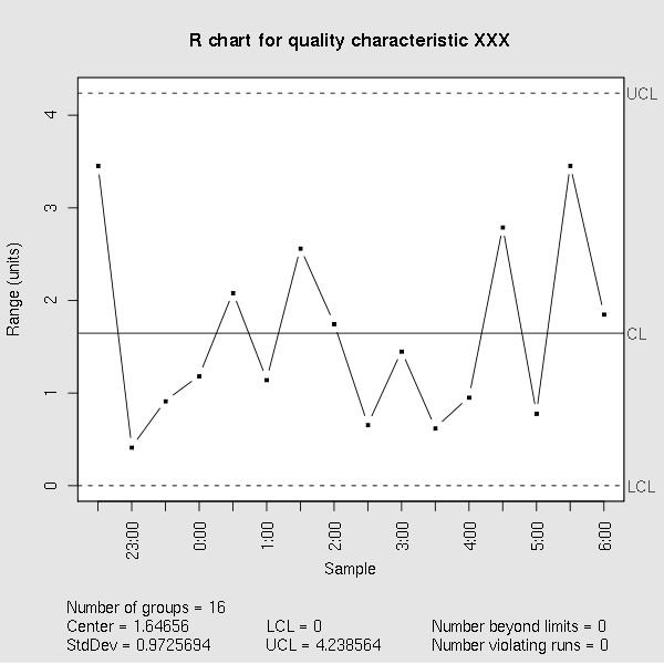
Note that some charts do not fully reveal their statistical information until they are paired with companion charts or data trees. X-bar/R control charting allows for subgroup sampling. Application opportunities include manufacturing processes.
You are now equipped with highly detailed knowledge pertaining to control charts in their various incarnations. Do not be content with the knowledge you gained and the possibilities that have opened up to you! Instead, consider the fact that a deeper analysis of X-bar & R control charts may yield crucial insights into your project management habits that were not previously apparent.
Moreover, a timeline analysis of C control charts may tip you off to non-conforming elements that seem to trail too many of the projects you undertake. This highlights the need for systemic organizational changes or a reconsideration of acceptable norms. Not surprisingly, only a highly detailed and frequent use of control charts data will ever allow the professional to mine this type of data.
Are you ready to get started?
References
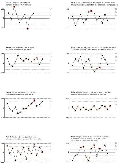
- Photo Credits: “Poster page showing all the rules (Nelson Rules) of a Control Chart” by GMcGlinn via public domain license; “Example R chart for a process that experienced a 1.5σ drift starting at midnight” by DanielPenfield via the GNU Free Documentation License, Version 1.2