Sample Six Sigma Histogram in Excel
Histograms and Six Sigma
The gathering and analysis of data is a key aspect of the Six Sigma quality control process. However, it’s easy to get caught in a situation where you have more data than you know what to do with, and trying to figure out how that data can be used becomes a project of its own. When trying to visualize large quantities of data, it often helps to create a chart or graph of some kind. One example of such an object is a histogram.
A histogram is really just a type of column chart in which items are grouped into several intervals instead of being plotted individually. This type of grouping can make it easier to see where problems are occurring in existing production processes, and it can also give a basic idea of how certain collections of data are distributed.
There are a number of software applications in which histograms can be constructed, but for this article, we will be concentrating on how to create one in Excel. One of the best ways to explain how to do this is to take an actual example and work through all the steps. The example we’ll be using here is available for download by clicking on this Sample Six Sigma Histogram in Excel. Feel free to download this template to use as a guide when working through this example or to modify for your own projects.
Gathering the Data
The first thing we need to do is enter all of the required data in Excel. In our example, we will look at a list of data that contains information on the number of defective products found in several manually inspected batches. The screenshot below shows a portion of this list. (Click any image for a larger view.)
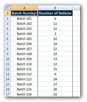
Although we’ve applied some formatting to this list to make it look a little prettier, that’s not really necessary, especially if you don’t plan to use the list in any type of presentation or distribution.
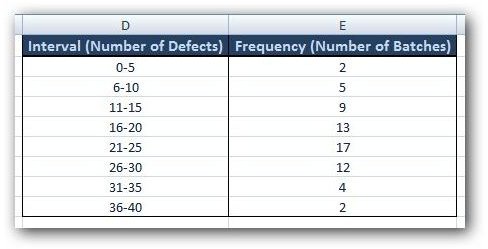
After the raw data is entered, the next step is to decide how to group that data into sections or intervals. There are many ways to accomplish this task, some of which use more advanced statistical analysis that is beyond the scope of this article. However, since our data collection is rather small (only consisting of 64 items), we’re going to use that highly advanced mathematical method known as “eyeballing” and just make a rough guess as to how we should group the information.
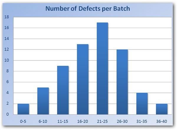
A quick glance at the data in our list shows that the number of defects in each batch is always between 0 and 40. So, we’ll try grouping that data into intervals of length 5. That is, we’ll determine how many batches have 0-5 defects, how many have 6-10 defects, and so forth. This information is displayed in the table shown below.
Now that we have the data in order, the next step is to construct the histogram in Excel. We’ll continue with that in Part 2 of this series.
This post is part of the series: Six Sigma Histograms in Microsoft Excel
This two-part series discusses how histograms can be used in Six Sigma analysis and goes on to give an example of how they can be created using only the tools found in Excel 2007