How to Interpret a Histogram Based on Data Inferences

Understanding Histograms
Accurate interpretations of histograms involve making inferences from the bar graph presentation, where each bar corresponds to a set of variables for a given data set. The placement of each bar along the horizontal line or X-axis represents the values of the intervals before the change in each variable occurs.
To analyze the data gathered, the frequency of the variables’ occurrences is determined by referring to the height of the bar. This is done by establishing up to which point of the vertical lines or the Y-axis each bar ends.
Knowing how to translate the values of the data set gathered from surveys, observations or discovery can help the user monitor a process, determine the profitability of an activity or to analyze the intensity of an element. It also involves determining the acceptable levels and limits, to ascertain which aspects of the processes have to go through further analysis for purposes of improvement.
A Case Study Sample to Illustrate How Histograms Are Read
Interpreting would be easier if aided by a case study to illustrate what the terminology means. Hence, follow the explanations for the case study below as we highlight each word.
Case Study:
An accountant for a manufacturing company undertook a study of the number of home made bar soaps produced for 25 customers. The objective is to furnish the project team with organized data that presents the frequency of job orders received for a certain level of production.
As a prelude to determining the consistency and constancy of the production process, the project team wants to determine the most number of job orders received for different levels of production in which the number of bar soaps varies. It seems that the bar soap formulation tends to differ in quality at different production capacity levels. One of the indicators being considered as gauge for desirable quality, is the production level based on the number of bar soaps per job order.
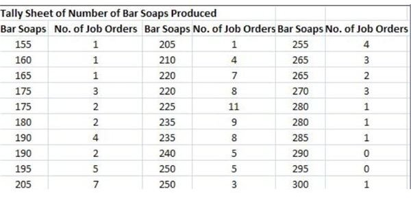
The Tally Sheet
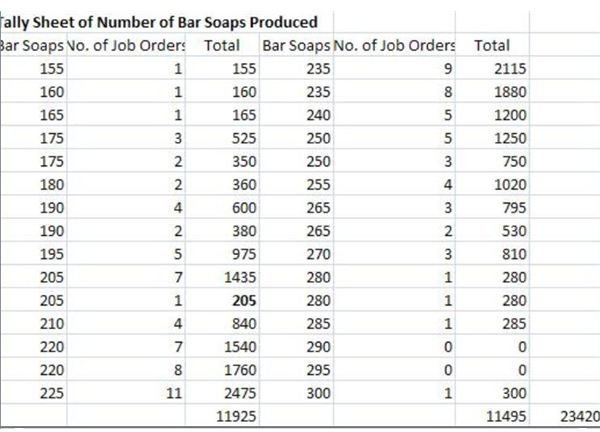
The accountant gathered about 105 instances in which homemade bar soaps were ordered by 25 customers. Each job order differed in the number of bar soaps generated during production. (Click on the screen shot images of the tally sheet for more data details.)
The variables under study are the number of bar soaps produced during 105 job orders. In order to determine the range or limit of data being analyzed, the difference between the highest value which is 300 and the lowest value of 155 is extracted, resulting to a difference of 145.
The upper specification limit therefore is 300 while the lower specification limit is _1_55**;** the range is 145, all of which refer to the number of bar soaps produced.
Determining the X-Axis or the Class Intervals
It is important that if all the information gathered is to be presented by way of a histogram, each data should be divided into class intervals or data sets that are proportionate to the range of bar soaps produced for each occasion. The standard intervals for the following data sets are as follows:
- Less than 50 – 5 to 7 intervals
- From 50 to 99 – 6 to 10 intervals
- From 100 to 250 – 7 to 12 intervals
- From 250 and above – 10 to 20 intervals
The accountant decides to use 10 intervals since the 145 range falls within the 100 to 250 bracket; then proceeds by establishing the data set or class interval by dividing 145 / 10 to get 14.5, rounded-off to 15.
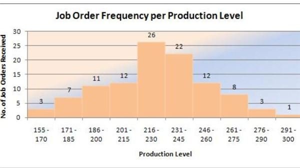
Thus, the X-axis is to be distributed according to the following class intervals starting from the lowest specification limit: 155 – 170; 171 – 185; 186 – 200; 201 – 215; 216 -230; 231 – 245; 246 - 260; 261 – 275; 276-290 up to the highest, which is 290 – 300.
Please proceed to the next page as we continue our discussion of interpreting histograms.
More of the Case Study Sample to Illustrate Histograms
Determining the Y-Axis or the Height of the Bar
Determine the height of the bar or the Y-axis by listing the corresponding number of job orders placed by customers next to the number of bar soaps for each production level. If necessary, add the number of points for each level of production that falls within the same range.
Again, you have to refer to the sample tally sheet in order to arrive at the following tabulation:
Number of Home-Made Bar Soaps
- 155 – 170 = 3 job orders
- 171 – 185 = 7 job orders
- 186 – 200 = 11 job orders
- 201 – 215 =12 job orders
- 216 - 230 = 26 job orders
- 231 – 245 = 22 job orders
- 246 – 260 = 12 job orders
- 261 – 275 = 8 job orders
- 276 – 290 = 3 job orders
- 290 – 300 = 1 job order
These are now the data sets to be used by the accountant in coming up with the histogram for interpretation. Study how a large number of data is summarized, in a way that allows ease in understanding all information gathered.
Understanding the Significance of the Mean and Median
Calculating the Mean
The “mean” is calculated by adding all the values of the variables — recall that in our example, the number of bar soaps produced in each of the 105 job order events represent the variables.
In summing them up, we arrived at a total of 23,420 bar soaps produced. To get the mean, 23,420 is divided by 105, which is the number of job orders, thereby arriving at a “mean” of 223, representing the average number of bar soaps produced.
View the completed graph on your right and take note of the variables that reached peak somewhere between 216-230.
Determining the Median
The median is calculated by dividing the total number of data points into two, which in this case study is the number of job orders. Hence, the median is calculated by dividing 105 / 2 = 52.5 rounded-off to 53.
- The sum of the first five set of data points = 3 + 7 + 11 + 12 + 26 = 59
- The sum of the second half of the set of data points = 22 + 12 + 8 + 3 + 7 = 46
Since the median is only 53, we adjusted the trend lines on the fifth bar by plotting up to a height of only 20 in terms of frequencies. The adjustment was derived by extracting the difference between the sum of 59 and the median of 53; to get six (6). The latter was used to determine the new value of the fifth bar by deducting 6 from 26.
Hence, the sum of the first five bars is now calculated as: 3 + 7 + 11 + 12 + 20 = 53
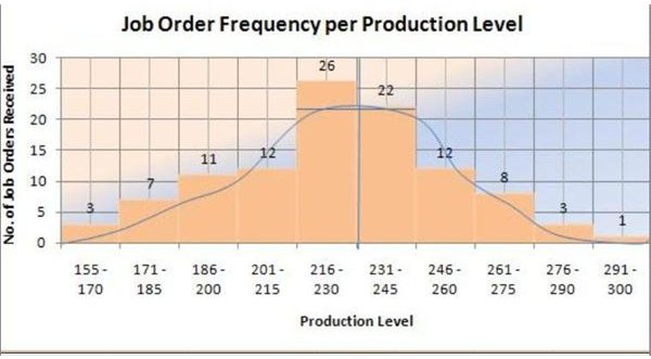
What this sample histogram means is that the peak extends only to 20, and not to the full height of the fifth bar at 26. It is at this point that the production level and the job orders are balanced and where the histogram achieves the normal or bell-shaped distribution.
In interpreting the analysis by way of distribution shape, we can infer that the normal distribution of production is at around 223 bars of soaps for 20 job orders.
Please proceed to the third page for this article’s explanations on how to determine the mode and how to figure out a skewed distribution.
Determining the Histogram’s Data Mode
The mode of the data for our sample histogram is the number of soap produced that has the highest number of job order frequencies. The tally sheet reveals that production levels for 220 bar soaps have the most number of job orders received at 8 and 7 data points.
Take note that the average number of bar soap production is at 223 bars, which is presented in the histogram’s distribution shape. The figure does not stray far from the mode of 220 bar soaps. Since this is also the average number of bar soaps per job order— we could surmise that for most customers, this is the purchase level that is most profitable at their end.
Figuring Out a Skewed Distribution
The process of analyzing a histogram should be objective, since the inferences derived are not the same for all histograms. The interpretations depend on the data being analyzed and are based on what the analyst or the project manager and the team wants to know.
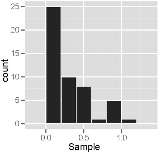
The normal shape for data distribution is bell-like and the peak denotes the point of balance between variables as traced by the trend line. Study the image presented on your left, which is a right -skewed histogram. If the data used for presentation are correct, this would denote that the business launched a full-blast mode at the initial stages of operations. Still, that is only hypothetical and will not hold water unless supported by facts.
Moreover, not all histograms can achieve a bell-shape distribution. If the shape tends to project skewness or spreads longer on either side of the chart, it is a representative of disproportion in data distribution. Hence, the analyst can only gather probabilities and has to subject the unevenness or disparity, to further investigations.
Summary:
Knowing how to interpret histograms requires an understanding of the objective or goal why the analysis is being performed. The data gathered should be relevant and factual because the resulting inferences are used for making informed decisions.
Random selection of data can result to skewness, to which a peak would be difficult to determine. In such cases, the “mode”, the “mean” and the “median” would be the likeliest metrics to use as references, in establishing the point of balance for data distribution.
Reference and Image Credit Section
Reference:
- Engineering Statistics Handbook : Histogram Interpretation Skewed ( Non-Normal) Right lifted from https://www.itl.nist.gov/div898/handbook/eda/section3/histogr6.htm
Image Credits:
- Histogramme proche by Romary avril lifted from https://commons.wikimedia.org/wiki/File:Histogramme_proche.svg
- Normexphist by Visnut lifted from https://commons.wikimedia.org/wiki/File:Normexphist.png
- Sample Tally Sheets for Histogram were created by the author to serve as visual aid for this article’s explanations.
- Sample Histograms were created by the author to serve as visual aid for this article’s explanations.
This post is part of the series: Histograms for Beginners
This series, Histograms for Beginners, explains histograms from the history of their development to their current usage.