Some Example Run Chart Applications
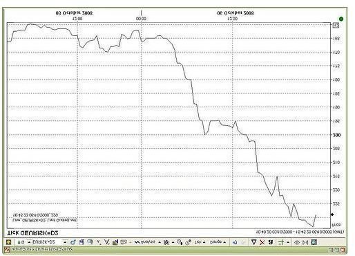
The run chart graph plots data that indicate trends, ranges or other variables in a time sequence, allowing monitoring of the process over time and evaluating performance. The tracking of several variables on a single chart generates a multiple run chart.
Run charts are similar to control charts that find use in statistical process control. Comparing run charts and control charts, run charts do not show the control limits of the process, making it much simpler than control charts and facilitating for the application of full range of analytic techniques. Inclusion of an average line in the run chart allows for easy measure of digression from the mean.
Image Credit: flickr.com/Shiny Things
Uses
Run charts find application for a variety of purposes. They are used to detect anomalies in standard processes, unusually long runs of any process, large digressions, aberrations from the average, cyclical movements, upward and downward trends, and shifts in process over time.
Many organizations apply run charts to track whether their key performance indicators (KPIs) behave in expected lines. If the points in the run chart move in the positive direction, the organization might want to capture and replicate the process that causes such positive shifts and movement of points in the negative direction may require corrective measures.
Applications
One run chart example is to measure the number of footfalls from shoppers in a retail store. Include the time in the horizontal “x” axis and the number of footfalls in the “y” axis, and plot the data to determine the peak rush hours of the day. Another application is to compare the footfalls by date, with the date on the horizontal (x) axis and the number of footfalls on the vertical (y) axis. The same method can be applied to plot revenue, profits, or any other variable, either separately on in a multiple run chart. For instance, plotting the number of footfalls and revenue could help detect cases where more footfalls lead to poor revenues, indicating that crowded stores puts off customers from making purchases, or staff became overwhelmed and unable to serve customers satisfactorily. A long-term decline in footfalls or sales volume could unearth some underlying problem with the store or staff. Product wise sales run charts could help detect seasonal trends in the product demand, and help make better purchase decisions.
Another example run chart application is to analyze the efficiency of hospital check ins, with the time to check in the patient on the (x) axis and the time of the day on the (y) axis, to determine the delay in transferring or admitting patients during peak hours. This helps hospitals take steps to improve their process efficiency and reduce patient discomfort or risk, which are both key objectives in a hospital’s balanced scorecard. Investigating this phenomenon could unearth potential for improvement.
In yet another example run chart, in a bottling plant representing time in the horizontal (x) axis and the number of bottles filled in the (y) axis help evaluate process efficiency. Different daily results might indicate non-standardized processes or the flaws in the system that necessitate ad-hoc measures.
References
- Engineering Statistics Handbook. “Run-Sequence Plot” https://www.itl.nist.gov/div898/handbook/eda/section3/runseqpl.htm. Retrieved 01 December 2010
- Skymark.com “Run Charts.” https://www.skymark.com/resources/tools/run_charts.asp. Retrieved 01 December 2010.
