Dashboards are somewhat a way of life for most businesses and even personal use, but are they really used to their best benefit or simply eye candy that demonstrates us as “show” instead of “know.” Explore the dashboard as a misunderstood tool that could be put to greater use than a mini-video game.
The Customer
A man walks into a car dealership after winning the lottery to buy his first car. The salesperson explains the car’s functionality. Although he realizes that the man has never driven a car, he calmly continues to describe the car’s advantages.
“What do these letters stand for?” The man asked, point to the steering wheel.
“The ‘D’ is for drive, and the numbers are the gears, with ‘1’ being the lowest gear on up, helping you to go faster.” The sales person replied.
“What does the ‘R’ stand for?” The man continued.
Well, at this point the sales person was getting pretty frustrated, so answered in a facetious manner.
“The ‘R’ stands for Rocket to activate a jet engine in the car.” The sales rep said, sarcastically.
The man looked satisfied, paid cash, and took the car right then and there off the lot. About an hour later, the sales person saw the man again come into the dealership with massive injuries. The look on the man’s face showed anger.
“Sir, what happened to you?!” The sales representative asked with shock.
“Well,” the man explained, “I did as you told me and started driving; putting the gear shift in the numbers 1 through 4 and the car was doing great. I wanted to go faster, so I shoved the gear shift in Rocket and man did that thing go!”
So much for the dashboard as a benefit to this customer. The sales rep did not explain the functions or how they interrelated, so the customer had no idea what one function would do. The “R” was not defined or described, so any description would fit.
What about other dashboards that is supposed to depict data or trends? Do they do what you want them to do?
Dashboards Are Supposed to Be Simple
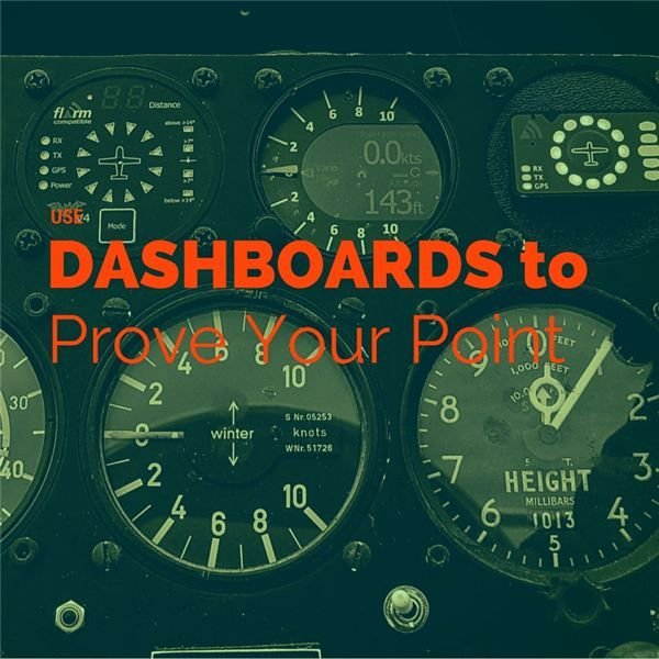
In the early 1970s when I was first learning to pilot a plane, the amount of dials and gauges that I had to scan were relatively straightforward. Now, there are many more dials, along with GPS and altitude/attitude devices, that the pilot is responsible for scanning. All this and, most importantly, keeping their eyes outside the cockpit for any aircraft is a very big responsibility that is compounded by the dashboard. Is the business dashboard any less complex or confusing? That is completely up to you.
There are several ways to visualize your data without having people go into fits trying to decipher that same data. Since dashboards are composed of graphs and charts, it is logical to assume that as you simplify the charts, so you simplify the overall dashboard. Sounds easy enough, but from what I have found simple for me is not simple for everyone.
For instance, I found a way of depicting data in Excel that is called a surface chart. This chart illustrates three different variables in a topographic form that I thought was pretty intuitive. Well, the first person I showed it to had two Masters Degrees from Carnegie-Mellon University and was ABD (all but dissertation) at Syracuse University. He told me that the chart was interesting and then asked what it meant.
I was flummoxed. How could a person educated to that extent not be able to decipher this chart? Then I realized that the problem was not the data or the chart, but the explanation of how to read it.
Here is an example of a surface chart. Without any further explanation, try to figure it out. What did you see as a trend with this chart? Do not read further without taking at least a minute to decipher the chart. After you are done, read on and see if you were right. Also, see if my description (that follows this paragraph) helps at all.
So what did you see in the chart above? The four digits must represent a year and the “R” or “F” must represent some entity. As for the “Count of Comp” or the “Sum of Yds” this might relate to compensation or to a length (yards, for instance). What about “Int?” Could this be interest, or some other financial term?
As you can see, there are too many questions about this table, and if this were part of a dashboard, people would be very confused. So in order to make this visual clearer, the first thing you would do is define the data terms in more concise fashion. This was a comparison of two NFL quarterbacks, taking into consideration some of their statistics and seeing if they compared well or not. The “R” and the “F” are the first letters of the quarterbacks last names, the “int” were the number of interceptions, the “yds” were the yards that they passed and the “comp” were the completions. If I had used full words, this would have been much easier to understand.
When we get past that and correct those deficiencies, the goal was to make the chart more readable. Besides the definitions of the data terms, it was essential that there would be no translation necessary to read the visuals. The surface chart above was too confusing to those that were familiar with that type of chart.
Explaining the surface chart is actually relatively straightforward. The surface chart is just a topographic chart, if you are familiar with mapping terms, so if you could picture a mountain range from the air, then you could figure out a surface chart. Some do not want a translation on a chart. They want something that is understandable by everyone, regardless of their background. That is why most dashboards have bar charts as their main form of visuals. Let’s do the same thing for the chart above and see how it looks.
This is not perfect, but it is a little more understandable. It shows that in 2005, QB2 has little if any interceptions, but not as many yards gained than QB1 in 2009. However, if you are comparing the same years, 2008, you see that QB2 had more yards gained, but more interceptions.
You can make many other comparisons, but the bottom line is that this chart is more readable than the surface chart. Picture an entire dashboard composed of charts and graphs that were as confusing as the surface. The results would be calamitous. First, the executive would not read the information, and consequently not understand the importance of that data. Second, your credibility would be forfeited.
What’s Next?
How do you solve these issues? The first thing you have to do is to determine the reason for the dashboard. The dashboard requirements make all the difference in the world, since they help you to determine how to visualize the data. From the data above, the only year that would be a side-by-side comparison would be 2008. However, the reason for the visual was to compare the first five years each quarterback played in the NFL. Unless you make this clear in the beginning, people will wonder why those years do not match.
The second thing you must do is make data visual by using as few charts as possible with the most information on that visual. This does NOT mean cramming a bunch of variables into a bar chart. What it means is putting as many variables into one chart that, at one glance, can make a difference. Just one example of this is a tree map, originally formulated by the University of Maryland, College Park, MD and is now offered through a variety of sources. There are several examples pictured in the article What Is a Treemap? with just one pictured below.
As you can see, there is an immense amount of data on this treemap and a legend at the bottom to translate the different colors. In all, this may focus on some trends that would otherwise not be visible in something like a massive bar chart. This is just one tool that can be used to build a dashboard that will not cause the driver to go into “rocket.”
Summary
A dashboard is composed of various graphs using pertinent variables and visuals that can enhance the look of data so that anyone viewing the visual can quickly understand what the data indicates. By decomposing the dashboard into separate graphs, and making each graph more understandable, along with determining the requirements for each chart, you as part of the project team or project manager can in turn make the entire dashboard more understandable. By just performing these little tweaks to the visual as depicted here, you can make your data more comprehensive and comprehendible. Try it with a visual representation at your company and build your dashboard credibility.