
If you want to perform an analysis of a process improvement plan that your company is implementing, it’s important to understand that companies functioning in today’s mercurial business climate respond best to cyclical reviews like the PDCA model.
The Measure of Success (or Failure)
Because today’s technology enables businesses to proceed full throttle around the clock, managers are getting much better at implementing process improvement plans. Companies form change teams. Quality Improvement committees meet. Employees become familiar with the lingo of improvement, like the PDCA cycle. Hence the need for an analysis of a process improvement plan.
Let’s say that you have implemented process improvement strategies at your company or organization. Now you need to analyze the results. What points should you pay attention to when you’re deciding whether or not the plan is working?
All Process Improvement Starts with a Plan…
First you have to take a step back and look at your process improvement plan. The PDCA model mentioned above works exceedingly well in today’s corporate climate. It stands for Plan-Do-Check-Act . Statistician W. Edwards Deming, who designed it way back in the 1920s, believed in applying statistical analyses in order to improve quality. He also, however, recognized the importance of the individual employee’s contribution to the corporate teamwork structure and in listening to customer feedback.
PDCA, then, involves the formation of a plan; doing the planned steps; checking the results of those steps; and taking action to improve the plan. When it works it achieves a constant upward spiraling of customer satisfaction levels.
Creating the Plan
When you form a plan, you have to identify that there is a gap between how something in your organization works and how you want it to work. Let’s use a simple example: Suppose you receive many phone calls a week about your services, but you don’t recruit many new clients. In order to boost client recruitment, your change team assesses input from current clients as well as from employees to come up with these factors:
- The client’s initial phone call for your agency’s services.
- The client’s initial visit to the agency.
- The time between a client’s first contact and his first appointment for services.
- His comfort level within your environment.
Your plan, then, implements these factors to come up with appropriate strategies:
- Your employees will provide quicker phone response times.
- Receptionists will be trained to be more courteous.
- Front-level employees will learn how to answer potential customers’ frequently-asked questions.
- Initial appointments will be scheduled as soon as possible after that first call.
- Appointment reminder calls will go out to the next day’s clients.
- A more inviting environment will be created in the lobby or waiting room.
Once the plan is implemented, how do you measure your success? That’s the “check” part of the cycle.
You’re at the Dashboard…
Many companies implement dashboard reports. You can create one of these on an Excel spreadsheet or use the Word table function. Decide—at the outset of your plan—how often you will measure the various metrics involved. Track them on your report form, and if improvement isn’t noted, then you’ve got to revamp the plan and try again.
The dashboard report is not limited to a simple scenario like the one described here. You can use it to present statistics on such factors as advertising costs, operating costs, FTE utilization, repeat customers, product defects, risks, or just about anything that can be measured numerically.
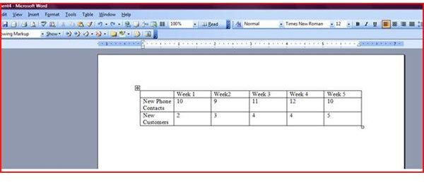
A dashboard report can be as simple as the simple Word table shown below, which shows nothing more than an increased number of potential customers who actually schedule appointments (click on image to enlarge).
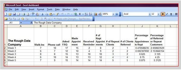
You can also use Excel or another spreadsheet application. This chart is simple but it shows progress in the number of clients who kept appointments and also clients who were referred or repeat customers (click on image to enlarge).
Pareto Charts – The Visual Advantage
Many companies prefer to use Pareto charts to perform an analysis of a process improvement plan. Factors being reviewed in your plan can be plotted on the chart with a line bisecting the 80th percentile. The 20 percent of factors that rise above the line is causing 80 percent of your problems. While Pareto charts are mostly utilized as a way to pinpoint problems, you can also input statistics to measure the success of your various improvement plan steps.
In the End…
As you analyze your plan, keep your eyes on these six basic tenets of the quality improvement process:
- You’ve got to get the customer’s input from the start of your process, and measure his satisfaction again at various stages of your project.
- Involve your front-line employees—the ones who input data or those who greet clients—and not just the department heads.
- Focus on goals that are important to your CEO, or else convince him to buy into your plan. Otherwise, he won’t back it.
- Choose someone to lead your process improvement plan who understands the logistics of change management or your plan will go nowhere.
- Ask colleagues at other organizations what problems they’ve confronted recently.
- Last but not least, don’t forget to Act—put your plans into action, analyze your success or failure, and then react as appropriate.
Image Credits
- Customers Welcome - Timailius / Flickr Creative Commons
- Dashboard Word Doc - Screenshot Linda Richter
- Dashboard Excel Doc - Screenshot Linda Richter