In the sea of task management and social productivity tools there are lots of fish to choose from, but both Asana and Do.com have been getting fairly high marks in many different circles. How do they compare to each other?
Basic Functionality
If you’ve been looking for a task management tool and you’ve had the chance to check out both Asana and Do.com, you’ve probably noticed that there are quite a few similarities between the two applications. For instance, both apps provide four levels of organizational structure to manage tasks and projects.
The top level, called Workspaces in Asana and Groups in Do.com, is used for grouping projects together. If you have a team of people who are all working on various parts of several different projects, you may want to put all of those projects in the same Workspace or Group. Likewise, you may want to create a private Workspace/Group for individual projects and tasks or a family Workspace/Group for managing personal items.
The second level, called Projects in both applications, is for grouping all of the tasks related to a particular project or program. Within each Project, you can create an optional third level of structure (called Section in Do.com and Priority Heading in Asana) to keep related tasks together. Finally, the fourth level of structure is for the tasks themselves.
Neither application allows for the creation of sub-tasks, although you probably could get a little creative with task naming to simulate a very rudimentary sub-task system. In addition, neither one supports the formal designation of task hierarchies, but both do allow you to enter comments on individual tasks. If you’re interested in more details about the basic functionality of each program, check out our separate reviews of each one here on Bright Hub PM:
- A Review of Asana’s Task Management Solution for Teams
- Do.com Review: A Web-Based Social Productivity Tool
Now, let’s take a look at the differences between the two apps.
Appearance and Ease of Use
Although this opinion is entirely subjective, the general layout of Asana is much more visually appealing to me than that of Do.com. The light blue and white colors, along with other various design elements, makes Asana look and feel more sleek and modern. The mixture of different shades of gray used in Do.com’s design may appeal to some users, but they seem a bit drab and depressing to me. That’s the last thing I need when looking at all the stuff that’s piled up on my task list.
In terms of actual usability, both Asana and Do.com are extremely intuitive and user-friendly. Asana’s help documentation is a bit more robust, but you shouldn’t have much trouble figuring out how to do things in either application even if you have to resort to a little trial-and-error.
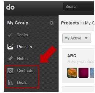
Managing Contacts, Deals and Notes
Since I last reviewed the application, Do.com has added a couple of major features that integrate the management of contacts and sales deals with the software’s task management system. While this may not be significant for everyone, it could prove extremely useful to those who build their to-do lists around things that need to be done for third-party clients. They may also make Do.com a potential candidate for organizations more interested in a lead management tool than anything else.
As I mentioned in my original review of Do.com, one of my favorite features in the application is the Notes section. In this area, you can jot down messages and ideas that aren’t necessarily connected to any project or task and save them to review later. Notes remain private to you until you do attach them to a project or task – and it only takes a couple of clicks to perform that action. At this time, Asana has no comparable feature that mimics the Notes tool.
Task and Project Management
In both Asana and Do.com, the developers have realized that we often have “repeating” projects, or groups of tasks that have to be performed multiple times in different scenarios – and each tool offers the functionality to make this easier, but they do so in a different way. In Asana, you can duplicate an existing project to copy all of the tasks from the original project to a new one with a single click. Then, you can make adjustments to the new project as needed. In Do.com, you can create project templates with a defined section and task structure. When it comes time to create a new project, you can choose to start from scratch or use one of your existing templates.
While this may seem like a very minor detail, another thing that I really like about Do.com is that you can collapse the section hierarchies within a project so that you’re only viewing the tasks related to specific sections at one time. In Asana, when you’re viewing a project, there isn’t a similar option for hiding the tasks grouped under a Priority Heading. As a result, you end up doing a lot of scrolling up and down, and that can be frustrating at times.
Another small point where Asana and Do.com differ is in the initial assignment of tasks. When you create a task in Do.com, the task automatically shows up in your personal task list, basically assigning the task to you even though there is no one listed as assignee in the task details pane. In Asana, newly created tasks remain completely unassigned until you specifically designate a person in the task details area. I prefer Asana’s approach to this issue since it’s much more flexible and it allows you to quickly see which tasks still need to be assigned. Plus, if you really do want to assign all new tasks to yourself, all you have to do is click the Assign to Me button in that task’s details window.
Summing Up
Even though there aren’t a lot of differences in the basic task management capabilities of Asana and Do.com, there are several minor things that could influence which one you like better. The point where the two applications really diverge is in Do.com’s extended features for managing contacts, deals and notes. Because of those additional abilities, I personally prefer Do.com overall, but I still like Asana’s interface design much better – and I wish Do.com handled newly created tasks more like Asana.
If you’ve tried both of the task management programs out, which one do you prefer and why? Is there one particular thing that made the choice a no-brainer for you? Or, are you like me, and wish you could somehow meld the two apps together, picking the parts you like from each one?
References
- Do.com Official Site: https://do.com/
- Screenshots taken by author.
- Asana Official Site: http://asana.com/