Project reports by their nature involve important and relevant data. This data needs to be presented in an interesting and demonstrative manner. No one wants to plow through dull and seemingly pointless charts and graphs. Let’s explore how to give them some pizzazz.
Compelling Presentations
We’ve all been there–reading through a report, finding page after page of charts or graphs that leave us asking, “What was that about again?” There’s not much worse than a series of charts that don’t make things any clearer than if they hadn’t been there. Just clicking on a few buttons in Microsoft Excel isn’t going to turn our raw information into a clear and compelling explanation of our progress. So what does?
Know When to Graph
Graphs can clarify the rate of change visually, or the differences in results, in ways that to our eyes mean so much more than a list of values ever could. It’s part of how we understand information and the differences between things. But every series of numerical values does not lead inevitably to a graph. Don’t graph just because you can. Some sets of values can actually lie to you when they are graphed, because there may only be a correlation between the values and not any causative connection. You must understand when a graph will really tell the story and when it will be superfluous or misleading. Take the time to think about what the sets of values you have are really representing before you leap into graphing them. Communicating with your team isn’t always visual.
The Art of the Chart
Knowing what kind of chart serves you best in a given situation is an art as much as a learned skill. We’ve all seen flow charts that have been created just because someone thought that a flow chart was a requirement. Flow charts and decision trees have their place, as do bar charts and pie charts. But using them in the wrong place with the wrong data is not only ineffective, it can be misleading. A flow chart that has nothing to do with process flow is really just a set of figures connected by arrows. If time and steps or stages are not involved, what are the arrows representing? It might be hard to abuse a decision tree, but our friends the bar and pie charts are two of the biggest liars out there.
Surprisingly, I’m not seeing as many graphs as I used to in internal corporate communications. Perhaps their abuse has led people to simply stick with tables of data.
Demonstrate Meaning
The key to making your project management and graphs capture the interest of your audience is to demonstrate meaning. You may say, “well, of course.” But consider that a very clear, obvious visual representation of the meaning behind the values is what you’re going for. So if your graph or chart isn’t interesting what would need to change? Is the data you are representing interesting? Is the conclusion the data leads to surprising or different than expected? Is there more variation or less than anticipated? Once you know these answers, consider what visual representation would press that point home. Hint: it’s probably not a plain bar graph or pie chart.
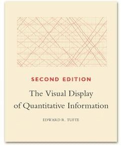
If these ideas intrigue you and you want assistance in knowing where to go next, check out The Visual Display of Quantitative Information by Edward R. Tufte.


