Quattro Pro X4 has a nice built-in utility that allows you to create Gantt charts, but that tool can be a little tricky to use if you don’t set up your initial data just right. In this tutorial, we’ll give step-by-step instructions for using the Quattro Pro Gantt chart tool.
Constructing Gantt Charts in Quattro Pro
Most dedicated project management software applications have some sort of Gantt chart utility that basically lets you click a few buttons and construct a Gantt chart with little to no fuss. However, you can also use almost any spreadsheet program to create one of these scheduling tools as well, if you’re willing to put in a bit of extra effort. Depending on the program, though, this may take some work as demonstrated in the tutorial on how to create a Gantt chart in Excel .
Quattro Pro users should have an easier time with this task, since Quattro Pro includes a built-in Gantt chart generator. Yet, this tool still has a few quirks, and it may take a little practice to get used to it. To make things a little easier, this tutorial will walk through the steps needed to create a Gantt chart in Quattro Pro X4.
Instructions
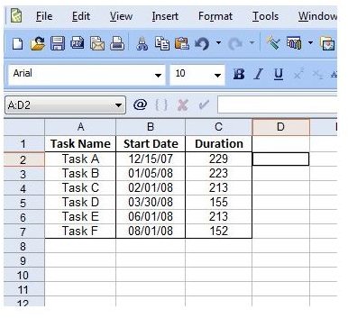
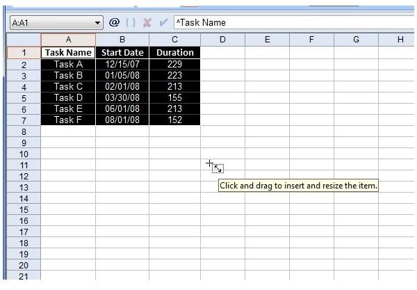
Step 1: To start out, enter the data for your Gantt chart in Quattro Pro. You should have three columns – Task Name, Start Date, and Duration of Task. If you want to include additional columns, that’s fine, but remember to only select these three columns when creating your chart. The screenshot below shows sample project data that we’ll be using during this tutorial. (Click any image for a larger view.)
Step 2: Select the three columns containing the Task Name, Start Date, and Duration information.
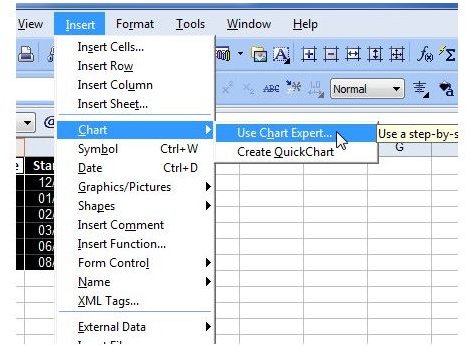
Step 3: From the Insert menu on Quattro Pro’s main toolbar, select Chart and then Use Chart Expert.
Step 4: In the first window of the Chart Expert wizard, don’t worry about any of the options except the one dealing with chart placement. Under the words Place chart in, choose whether you want to include the chart in the current sheet or place it in a new chart window. For this tutorial, we’ll keep the chart in the current sheet.
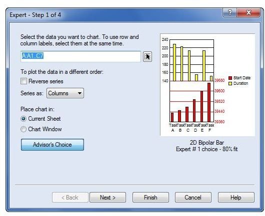
Click Next to continue.
Step 5: In the second screen of the Chart Expert wizard, select Gantt.
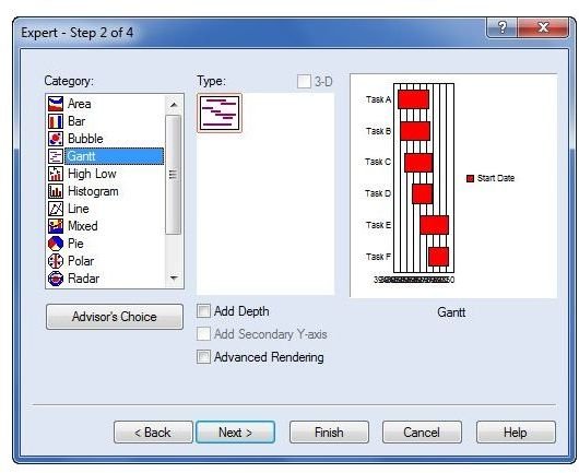
Click Next to continue.
Step 6: The third window allows you to enter titles and labels for the chart itself as well as the chart axes. Entering information here is completely optional.
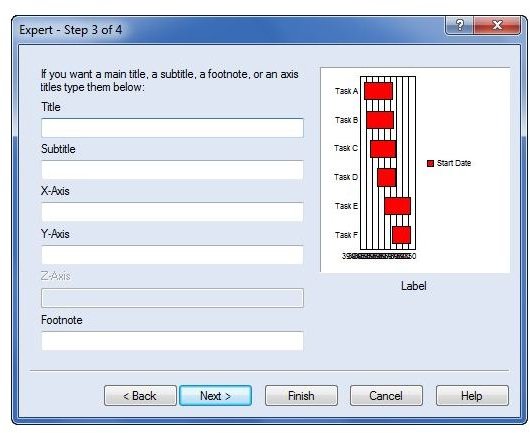
We’ll just leave those blank for now and click Next.
Step 7: The fourth and final window of the Chart Expert wizard gives you the opportunity to pick a color scheme for the chart. This is for purely aesthetic purposes. For now, we’ll just accept the default theme.
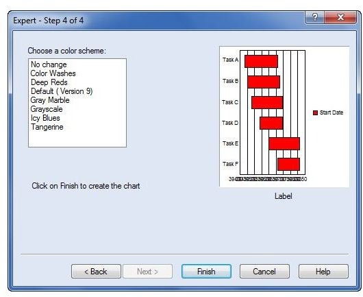
Click Finish to continue.
Step 8: Unlike with Excel, charts do not immediately appear when they have been created. You must first click anywhere on the spreadsheet, hold down the mouse button, and drag the mouse to define your chart area.
When you release the mouse button, the Gantt chart will appear on your sheet.
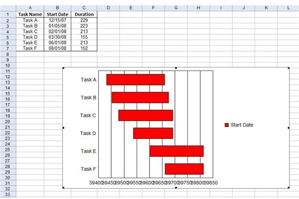
Unfortunately, we’re not quite done yet. Note that the dates are showing up as numbers – that’s not very helpful. Also, we really don’t need the legend that’s showing up on the side of the chart. So, we’ll go through a couple more steps to fix these problems.
Modifying Chart Defaults to a Quattro Pro Gantt Chart
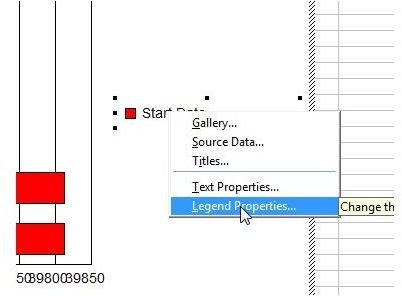
Step 9: First, we’ll get rid of the legend. Click on the legend to select it. Once the legend is selected within the chart, right-click and choose Legend Properties.
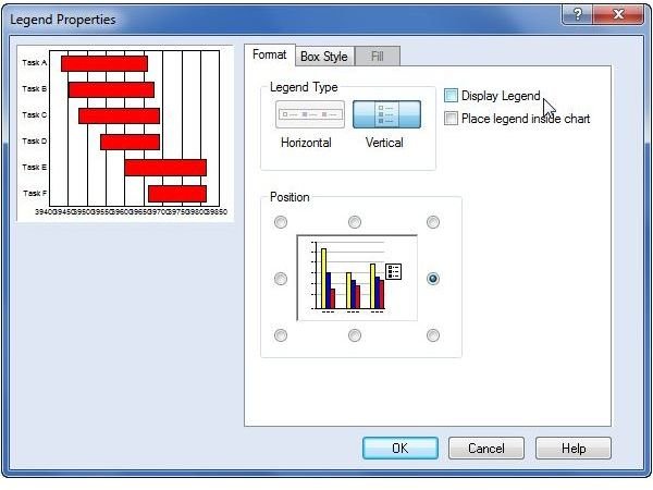
When the Legend Properties window appears, remove the check mark from the box next to Display Legend by clicking on it.
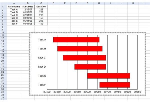
Click OK and you will exit the Legend Properties window to return to the Quattro Pro spreadsheet with the Gantt chart. The legend will no longer be present, as shown in the image below.
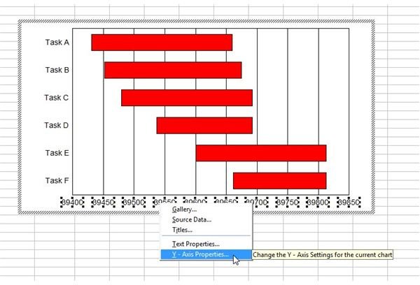
Step 10: Finally, we want to modify the data so that the dates are actually in date format. To do this, first click anywhere on the date axis labels to select that information. Then right-click over that same area and choose Y-Axis Properties. (Note: Despite the fact that this axis really looks like the X-axis due to the layout of the graph, Quattro Pro is calling this axis the Y-axis since the chart is turned on its side. If this bothers you, trust me – you’re not alone.)
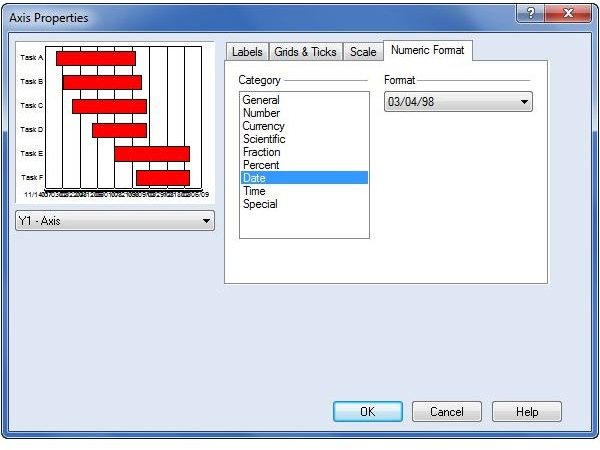
When the Axis Properties window appears on your screen, select the tab labeled Numeric Format. From the Category list, select Date. Then use the drop down box to choose the exact date format that you want to use. As an example, we’ll pick the 03/04/98 format.
Additionally, if you want to change the number of dates shown on the chart, go to the Scale tab and enter a new number for Increment. In this example, 1 denotes 1 day, so we can make a change to use an increment of 91. This basically represents three months. So, on the Gantt chart representation, the intervals will be broken up into three months and the corresponding start dates for those intervals will be shown.
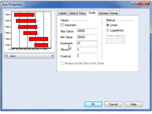
The value you choose here is dependent on the length of your project and how much detail you want to depict.
Click OK when done to exit the Axis Properties window. You’ll be returned to the Quattro Pro spreadsheet with the changes applied to your Gantt chart.
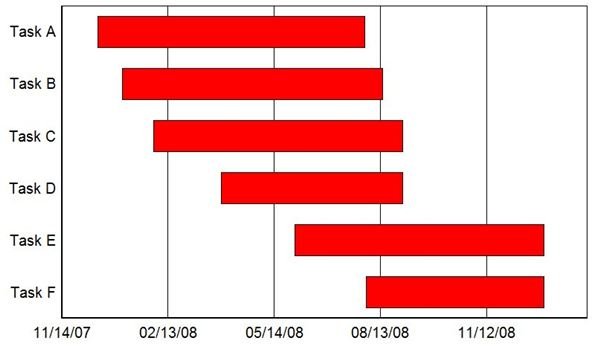
From here, you can dress up the appearance of your chart using the same methods you would for any other chart in Quattro Pro.