Example of a Gantt Chart Using Conditional Formatting in Excel
The Gantt chart is a popular and useful tool in project management. It lends clarity, enhances communication, and makes managing and controlling projects easier—among other benefits.
There are many ways to create Gantt charts, including several specialized software applications dedicated to the purpose. However, if your project schedule is fairly simple, you can also use MS Excel to create the chart. Although Excel 2007 does not have a Gantt chart wizard, it is still possible to create this scheduling tool using a few simple tricks.
One common way of creating a Gantt chart using MS Excel is by customizing a stacked bar chart. Another simple way is by using conditional formatting. We’ll take a look at a sample that illustrates the latter.
Step 1: Tabulate the Data
The following example shows the steps involved in creating a Gantt chart using conditional formatting in Excel. (Note: Click any image in this article for a larger view.)
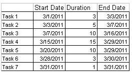
Suppose your project schedule consists of the following tasks.
- Task 1: start date 03/01/2011, duration 3 days
- Task 2: start date: 03/03/2011, duration 5 days
- Task 3: start date: 03/07/2011, duration 10 days
- Task 4: start date: 03/15/2011, duration 15 days
- Task 5: start date: 03/20/2011, duration 10 days
- Task 6: start date: 03/28/2011, duration 3 days
- Task 7: start date: 03/31/2011, duration 1 day
To create the Gantt chart, first create a table in Excel that lists out the start date and end date of each activity. Column A should contain the task name, Column B represents the start date, Column C represents the duration and column D shows the end date.
Type the formula “=B1+C1-1” to generate the end date automatically in Column C.
Step 2: Plot the Data
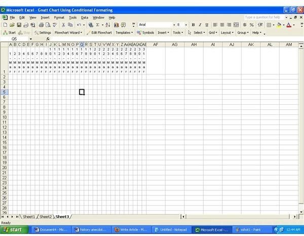
The second step is to plot the data in MS Excel, providing the date values in a row as the column headers and the task names in a column as the row headers.
For the above example, in Row 1, list out all dates for the period (March 2011 in this case) starting from Column E. The plotting can also take place in a separate sheet, if desired.
Step 3: Apply Conditional Formating
The last step is to apply the conditional formatting option. Follow these steps:
- Select the applicable cells. In the example quoted above, select rows E2 to AI6, either by pressing control button or using mouse.
- Select “Formating Option” from main menu. From the sub menu, select “Conditional Formating.”
- Change the default option “Cell Value is” to “Formula is.”
- Enter the following formula =AND(E$1>=$B2,E$1<=$D2)=TRUE. The cell value E1 depicts the start of the selected range, and the cell values B2 and D2 depict the start date and end date in the table containing the values. Each cell depicts a date, and the formula calculates whether the date value of the cell is greater than or equal to the start date, and less than or equal to the end date. If these conditions are fulfilled, the cell is marked for formatting.
- Select the desired formatting, that is the required color for the Gantt chart, with any optional design.
- Click OK.
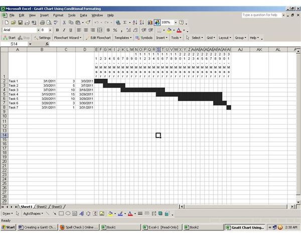
The Gantt chart is ready, as depicted in the adjacent screenshot.
Download this Gantt chart using conditional formatting in Excel from the Bright Hub Media Gallery
For an in-depth look at Gantt charts and additional resources in other software applications, please see the Bright Hub Guide on Gantt Chart Examples and Tutorials by Michele McDonough.
References
“Create a Gantt Chart in Excel.” https://office.microsoft.com/en-us/excel-help/create-a-gantt-chart-in-excel-HA001034605.aspx. Retreived 16 March 2011.
Screenshots taken by author.