Ever wondered how your team’s motivation is influenced by compensation or training? How can you be certain that a change in a parameter will definitely lead to the desired effect. Scatter Plots (Scatter Diagrams) are there to help you.
Before we look at examples of Scatter Plots, let’s first answer some basic questions.
- What is a Scatter Plot?: A scatter plot is a graphical representation of two variables taken from a data set.
- Why are They Used?: Scatter plots are used to detect correlation between the two variables being examined. This is crucial for determining Cause and Effect relationships, somewhat similar to the use of a Fishbone Diagram .
- Who uses Scatter Plots?: Anyone interested in examining the relationship between two variables to detect correlation. Therefore, a broad array of professionals would use them, including Six-Sigma Professionals, Researchers, Project Quality Management professionals, and Project Managers.
Note: For project management certifications, such as PMP, it is critical for you to know how to interpret the correlation of Scatter Plots. This skill is a part of the Project Quality Management knowledge area.
Now that you know What, Why and Who, let’s look at the types of Scatter Plots.
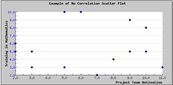
Zero Degrees of Correlation in Scatter Plots
The look of a scatter plot is dictated by the degree of correlation between two variables. For example, in the diagram shown below, there is no correlation. This is evident by the fact that the data points of the variables are spread across the Scatter Chart. Hence, you can’t create a straight line from the scatter plot shown below.
The Scatter Plot (Scatter Diagram) shown above could be of project team motivation and the car driven by team members. There is no correlation, hence the data points are scattered. Or consider the value of the cost performance index and giving project team members training on Mathematics, i.e. the training on mathematics will not help the cost performance index of the project.
Low Degrees of Correlation in Scatter Plot
In the diagram shown below, the data points form some sort of line. Therefore, there is a vague correlation between the two variables. Other variables may contribute to the effect.
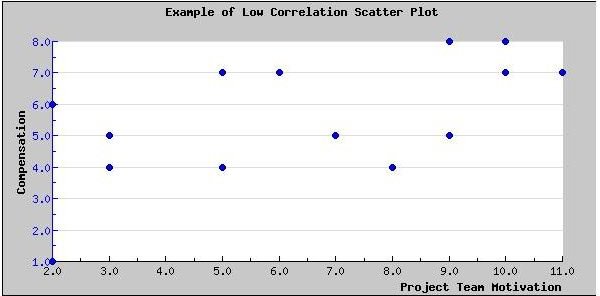
The Scatter Plot (Scatter Diagram) shown above could be of project team motivation and compensation. Project team motivation has several other factors. For some project team members, compensation may be the only factor for motivation. While, for others, training, management style, and even project management methodology, probably plays a role. In this case, it is highly improbable that an increase in compensation would yield significantly higher project team motivation.
High Degrees of Correlation in Scatter Plot
In the diagram shown below, the data points are grouped more closely together. The line is more evident here. Therefore, there is a strong correlation between the two variables.
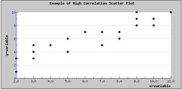
The Scatter Plot (Scatter Diagram) shown above could be that of two related variables, such as the probability of getting a contract and the skill-set within the project team, i.e. if the contract requires Prince2 certified professionals, then getting such professionals in the team is probably going to help you get the contract. Another example could be the relationship between managing project risks and delivering on-time, on-budget.
In this article, I’ve been using the term “probable” to describe the correlation. When all data points lie on a straight line, the correlation between the two variables is not probable, but certain!
Type of Correlation in Scatter Plots
Scatter plots can either have a positive or negative slant, as shown below. A positive slant would indicate a positive correlation. For example, the more a person studies the higher the score on an exam. Or, the more testing you do, the more defects you’ll probably find.
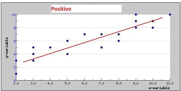
For a negative slant, an example could be the decrease in project profits as the cost of project resources increases.
To learn to create a Scatter Plot in Excel, read Microsoft Excel 2007: Create a Scatter Plot .