In Project Quality Management, knowing when a process is in control and stable is critical to ensuring the consistent and predictable project performance. A quality control chart helps you determine the need for process improvement investigations. Use of a control chart is also covered.
Know Your Charts
Quality control charts are used to determine whether a process is stable over time. In project management, one of the uses of control charts is to keep a track on the Cost Performance Index (CPI) and Schedule Performance Index (SPI) . In this article, we’ll use CPI as an example to understand and interpret a quality control chart. Each quality control chart example illustrates a need to investigate the process.
PMP Tip: Quality Control Charts is relevant for PMP aspirants and pertains to the Project Quality Management knowledge area.
Visual Representation
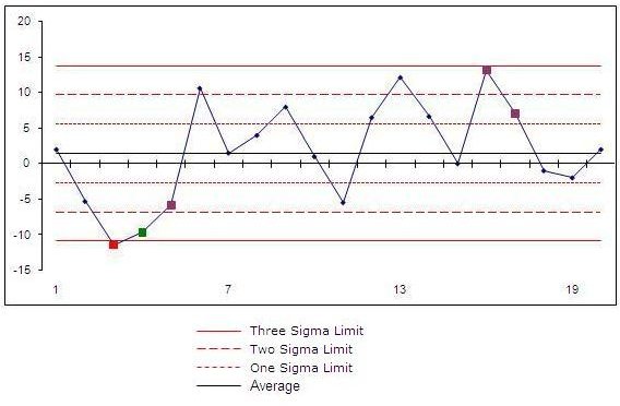
A quality control chart always has a central line for the average, an upper line for the upper control limit (UCL) and a lower line for the lower control limit (LCL). These lines are determined from historical data or by a 3-sigma control limit. Similarly, 2-sigma and 1-sigma are also represented in the quality control chart. The image below represents a quality control chart.
Read the Essential Quality Assurance Terms - Definitions and Meaning article for meaning of key project quality management terms.
Interpretation
In this section, we’ll view basic tests that you can apply on quality control charts to identify whether a process is stable. Each of the quality control chart cases mentioned below provides triggers to investigate a process. However, it is never certain that if a specific case exists, the process needs rectification. It is certain that you should investigate it and there is a high probability that there is a problem that needs to be resolved.
The basic tests or uses of a control chart are:
• One point outside the 3-sigma limits
If one of the data points lies outside the UCL, LCL, or 3-sigma limits, you should investigate the special causing this. The image below shows two points which lie outside the UCL and LCL. Each point should be investigated.
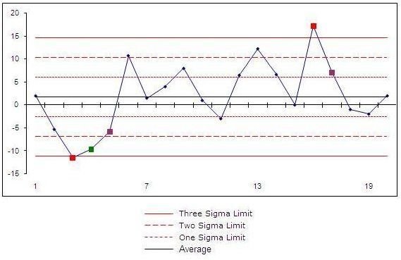
• Seven consecutive points on one side of the mean
If seven consecutive data points lie on one side of the mean, there is a need to be concerned and the process should be investigated. The seven consecutive points may lie above or below the mean. The quality control chart below shows a series of consecutive points above the mean.
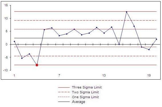
• Six consecutive points trending up or down
If six consecutive points show an upward or downward trend, there is a need to be alarmed. For example, if your CPI figures are 0.8, 0.95, 1.0, 1.05, 1.10, and 1.2, it is safe to assume that action needs to be taken before your project blows the budget. The quality control chart below shows a trend.
Apart from tracking CPI by using quality control charts, these charts can be used to track SPI. To investigate issue, you can use the Fishbone diagram technique .