Choosing Key Performance Indicators (KPIs) to track project progress is an important decision for a project manager. In this article, we’ll go over four key examples of KPIs, as well as tools and representations to measure the progress of your project.
Examples of KPIs to Measure Progress
When an executive, project sponsor, PMO member or client wants to know how a project is going, they don’t want to read status reports or several pages of text that help describe what is going on. What they want are easy-to-understand metrics that answer the questions that they have, that will accurately paint the picture they need. In fact, when it comes down to it, there are really four things they want to know.
- Are we on schedule?
- Are we on budget?
- How much is left to do?
- How much have we already done?
There are many other examples of Key Performance Indicators that you can use; however, they will essentially roll up to one of these four topics. In fact, knowing the answer to each of these four questions should be enough for you to know if your project is red or green, in true stoplight fashion. Conversely, only knowing a few of these answers won’t be enough to tell you much at all. If you are on time, but over budget, then that’s not a good sign. Nor is the outlook optimistic if you can’t articulate what there is left to do or what you have already done.
You need an accurate and simple way to convey your project progress , as measured by these Key Performance Indicators, to anyone who needs to know the answer. In order to be useful, they need to be easy to understand while conveying the information necessary. Let’s look at two examples of communication tools–that can be used in conjunction–to deliver all four of these factors to project stakeholders.
Burn-Down charts as an Example of a KPI Communication Tool
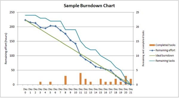
The burn-down chart is a tool that is often associated with the Scrum methodology. On the X-Axis of the chart (click on the image) is time. This can be project time, iteration time, or some other unit of time that the project team is used to dealing with. On the Y-Axis is the outstanding work, usually known as the backlog. See the picture for an example of what a burn-down chart looks like.
The purpose of this chart is to show how much work is remaining. There are three main inputs: the planned work complete, the planned work remaining, and the actual work remaining. When the project manager makes the project plan, he plans each iteration or unit of time with an idea for how much work is going to get done in each unit. As time passes, the completed work grows, and the remaining work shrinks. A line can then be drawn that shows the actual work remaining. If the amount of work remaining to do is above the line, then you should quickly be able to determine that you are behind schedule. If you are below the line, then you are ahead of schedule.
With this kind of KPI to use as an example, you can quickly communicate project schedule status. With this kind of obvious visual aid, you can tell early on if you are behind. Many projects find themselves unexpectedly behind later in the project, because they lacked a good way to track progress along the way. Using a burn-down chart as a key performance measure, you can often tell very early on in the project if you need to figure out where to make up time.
Please turn to page 2 for more examples of key performance indicators
Earned-Value Charting as a Key Performance Indicator
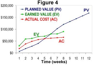
Earned-Value charts look similar to burn-down charts, but they are actually quite different. They are a way to measure adherence to schedule, budget and project scope, all at the same time. Rather than burning down, an earned-value chart trends up as the project progresses. It measures value planned, value created, cost expended, and elapsed time, all in one chart. With three simple lines on a graph, you can tell virtually all of the KPIs mentioned on page 1.
See the picture to the left for an example of what an earned value chart looks like. As you can see, the blue line represents how much value the project is supposed to have created compared to the time elapsed. Value can either mean something like functionality built, or tasks complete, or even literal sales made. Whatever your project team decides to use as value, this chart will help graph it.
The green line represents how much value has actually been created, using the same metrics . If the green line is below the blue line, then you are behind schedule. If it is above, then you are ahead of schedule. It is very possible to flow back and forth from being behind to being ahead, and back again. The red line represents cost. If the cost is below the blue line, then you are under budget, if above, you have spent more than allotted to the budget.
When you put all four dimensions together, planned value created, actual value created, cost and time, you can get a very powerful and very simple view of how your project is doing.
Project Progress Key Performance Indicators
There are many examples of key performance indicators for project performance. However, they all break down into cost, schedule, work remaining and work complete. A project that overcomplicates how they are measuring progress, or fails to measure progress at all, can easily go astray , and the PM will not know it until it is too late. Using either a burn-down chart, or an earned value chart, you can easily tell at a glance how you are doing. Being able to communicate to all project stakeholders has incredible power, and you will instill confidence in the project, no matter the outcome.