A Pareto chart is a very popular Six Sigma tool. It is a special type of histogram that allows business leaders to determine if the Pareto Principle applies. Learn about the principle and how it applies to Six Sigma DMAIC projects and process management.
The Pareto Principle
The Pareto Principle is named after Italian economist Vilfredo Pareto and is also known as the 80/20 principle. Pareto noted that 20% of the population was receiving 80% of the income. Quality guru Joseph Juran expanded the idea to incorporate other instances where the 80/20 rule applied and named the principle after Pareto.
Examples of the Pareto Principle abound throughout business and society. A nonprofit receives 80% of its donations from 20% of its donors. A call center receives 80% of its contacts from 20% of its customers. A pizza business gets 80% of its late delivery complaints from 20% of its customers. A supervisor spends 80% of his or her time dealing with 20% of employees.
The exact 80/20 proportion is not as relevant as the general principle: that a large portion of results come from a small portion of causes, types or circumstances.
Why is this important for Six Sigma ?
For project selection, business leaders should focus on the critical few. Rather than trying to devote resources to every problem, complaint and idea (which is generally not feasible) they should seek to address the ones with the greatest impact on customer satisfaction, employee satisfaction and profitability or ability to achieve the mission.
Similarly for a specific DMAIC project , team members explore types and causes of a particular problem, and determine which to focus on for improvement efforts.
In many cases the Pareto Principle does apply and it is a fairly simple matter to identify where to target efforts. In others however, the initial expectation about its application does not hold and additional ways of breaking out the data must be examined.
For instance, a nonprofit might find that the usual pattern of receiving a majority of donations from a minority of donors does not hold. The leaders might instead look at donations broken out by type of fund-raising effort: perhaps a majority of their funds come from a small portion of their fund-raising activities and they could improve results by focusing on those and reducing others.
A call center team might find that their assumption that most of their technical support calls for a specific product come from a small percentage of customers is not in fact correct. However they might then examine the data differently and find that a majority of contacts are for a small percentage of problem types or from only one or two customer segments. This would give them valuable information about the problems customers are having and how to make improvements with the highest return.
Pareto Charts
A Pareto chart is a popular Six Sigma tool. It provides a visual display of data in a manner that makes it easy to determine whether the Pareto Principle holds.
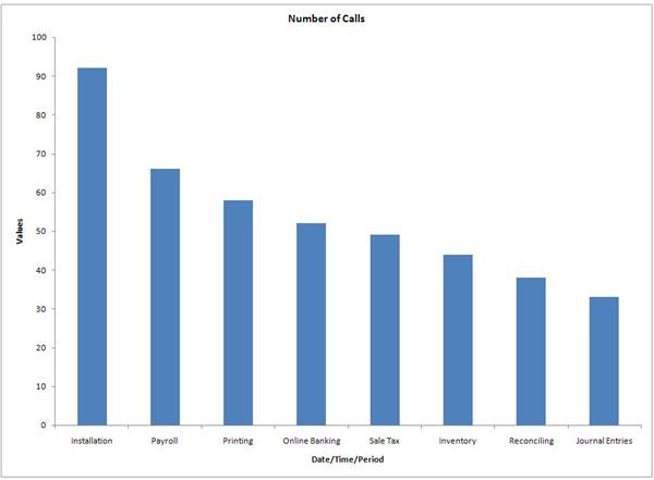
The x-axis shows the categories into which the data is broken out; this is the discrete-attribute variable . In this example, the categories are types of technical support calls for financial accounting software. The y-axis shows the number of instances in each category, a discrete-count variable.
The data is arranged in a specific way. The categories are ordered from most common to least common. In some cases when there are a great many categories, those with the fewest instances are combined into a final “Other” column.
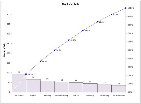
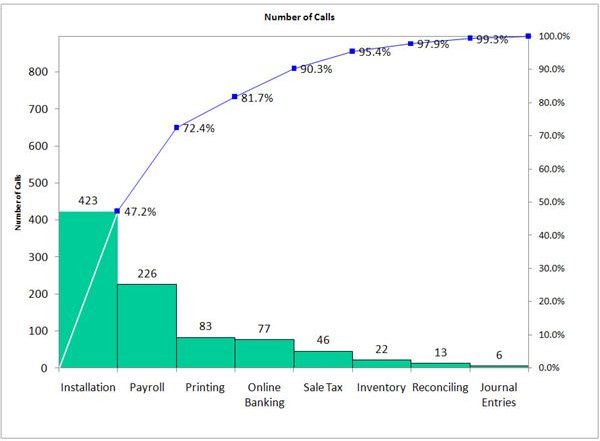
In addition to the number of instances in each category, the cumulative percentage of the total is shown as a number and as a line graph. This provides the quickest way to see if the principle applies. In the example shown here, the first category makes up 47% of the instances. In other words, nearly half the tech support calls are for this one reason. Once you include the second most common category, the total goes up to 72%.
While this isn’t quite the 80/20 proportion, it is close. If the team can address just these two areas, they will have a substantial impact on customer satisfaction and on call volume and costs.
Note that unlike a histogram , a Pareto chart should always have a y-axis that extends to include the value for the total number of instances, even if the line graph for cumulative total/percentage is not included. It is easy to make incorrect assumptions viewing data that is not displayed appropriately, as in the example below where the principle clearly does not hold.