In the second part of this series looking at Six Sigma histograms, we’ll show how to construct a chart of this type in Microsoft Excel 2007.
Constructing a Histogram in Excel
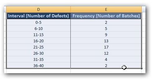
In Part 1 of this series, we gave a little background on how histograms are used in the Six Sigma quality process and described how to prepare the data for graphing. Now, in this segment, we’ll take a look at how to actually create a histogram from this data in Microsoft Excel 2007. We’ll be using the same example we discussed in Part 1. The Excel file containing the data and charts for this example is in the Project Management Media Gallery under the title Sample Six Sigma Histogram in Excel. Feel free to download this template for your own personal use.
Step 1: Select the data that you want to use to construct the histogram. (Click any image on this page for a larger view.)
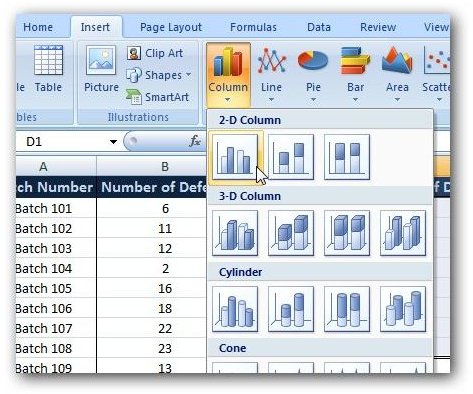
Step 2: Open the Insert tab on the Excel ribbon, and click on Column in the Charts group. In the window that opens, select the first chart under 2-D Column.
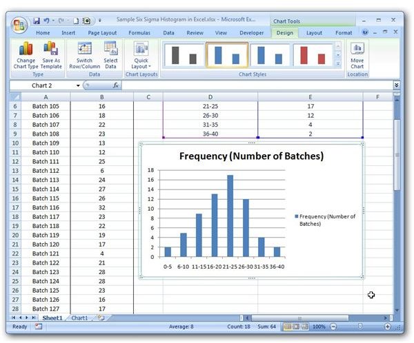
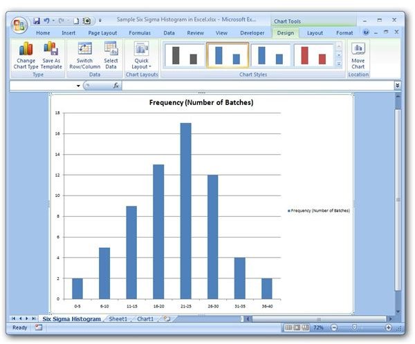
Step 3: The chart, by default, will appear in the same worksheet as your data.
Step 4 (optional): If you want to move this to a new sheet, click on the chart and make sure the Design tab under Chart Tools is open. Then click on the Move Chart button.
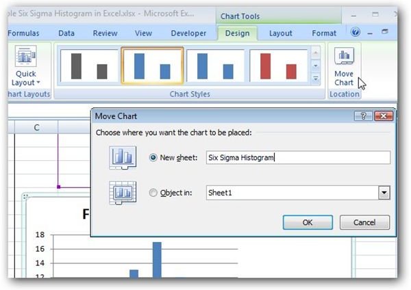
In the Move Chart dialog box, select the radio button next to New Sheet. You can enter a specific name for the new worksheet that will contain only the chart or you can accept whatever default name is given. Click OK and the new worksheet will open containing the histogram.
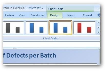
Step 5: Make any formatting changes to the chart using the options found in the Design, Layout, and Format tabs under Chart Tools on the Excel ribbon.
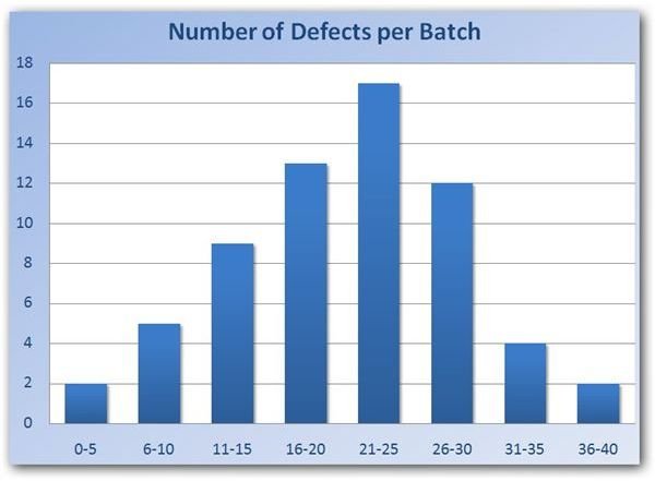
The screen shot below shows just one example of how the finished histogram may look with custom formatting applied.
Now that the histogram is complete, you can share or distribute it to others on your team. If you’re preparing a presentation and want to include this chart as an exhibit, you can even import it into a Power Point slide .
Additional Resources: Microsoft Excel 2007 can be used to create several other project management charts and diagrams as well. For more information, see the following Bright Hub articles.
Using Excel to Create a Gantt Chart
Creating Pareto Charts with Microsoft Excel 2007
Also, check out the article 10 Free Six Sigma Templates You Can Download for a collection of Microsoft Excel and Publisher templates that can be used for fishbone diagrams, PICK charts, and SIPOC diagrams, all of which can be freely downloaded to use for your own projects.
This post is part of the series: Six Sigma Histograms in Microsoft Excel
This two-part series discusses how histograms can be used in Six Sigma analysis and goes on to give an example of how they can be created using only the tools found in Excel 2007