A Pareto chart’s main purpose is to provide information about whether categorical data can be described using the Pareto principle. Find out why this is useful for a Six Sigma project and when you should use a Pareto chart to display and interpret your data.
Using Pareto Charts
Pareto charts are commonly used in Six Sigma, particularly during DMAIC projects. Named after Wilfredo Pareto, this type of chart is similar to a bar chart but shows categorical (discrete) data arranged in order of highest frequency to lowest frequency. (Occasionally the categories that occur the least often are combined to create one category at the end simply called “Other”.)
In addition to showing bars depicting each category’s frequency, labeled with the category name and frequency, a Pareto chart also includes the cumulative percentage. This is the percentage of all the data accounted for by totaling the counts from the first category to the current category. If the Pareto principle applies, a very small number of categories contains 80 percent or more of all the data.
Let’s look at some examples of when to use Pareto charts:
Evaluations of different types of defect data, including customer complaints, process errors, and defective products, represent some of the most typical examples.
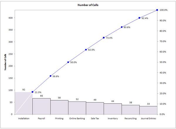
Suppose you are a Black Belt conducting a DMAIC project in a call center that handles technical support for an accounting software program. Your project team is trying to find out why the satisfaction rate for customers is so low. Since the support teams take a wide variety of calls, you want to find out whether the low satisfaction ratings or complaint data are tied to specific call types, or whether the problem is similar across the board.
To assess this you create the Pareto chart below, which shows the number of calls that received unacceptable satisfaction ratings broken out by call type. (Click on the image to view it in larger format.) Note that as with all Pareto charts the categories are arranged in order from most frequent to least frequent. Just by eyeballing the chart you can see that there does not seem to be a subset of call types that is responsible for most of the poor satisfaction ratings. The cumulative percentage data confirms this: you would have to include all but one category to have at least 80% of the data points, meaning the Pareto principle does not apply. So the project team will need to investigate other ways of breaking out the data.
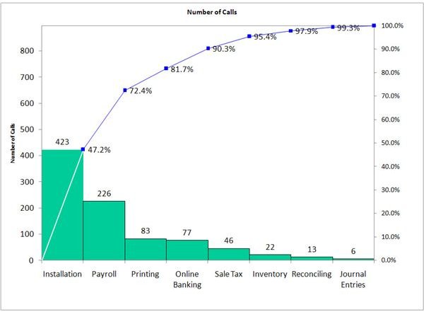
Alternatively, if the data shows the results depicted below, the project team would probably decide to focus on the first two call types as they work through the phases of DMAIC to improve customer satisfaction.
In manufacturing, you could use a Pareto chart to assess whether the Pareto principle applies to product defects, by looking at defects broken out by employee shift, assembly line, product type, or any relevant input settings that vary randomly or over time. For a mortgage loan application process, use a Pareto chart to view defects such as incomplete applications or errors on applications by type of loan, branch processing the application, type of customer, or other relevant parameters.
Pareto charts are also useful before business leaders even charter Six Sigma projects for identifying high priority process improvement issues. Customer complaints or other process defects can be analyzed using a Pareto chart to find out which are the most common and how major improvements can be accomplished by addressing only a few issues. Leadership teams can then establish the critical few business priorities and use this information to charter DMAIC projects tied to these priorities.