A histogram is an excellent tool used in project management and many other disciplines to analyze a collection of data. Read on to learn more about histograms, how to understand their representations and when to use them.
What is a Histogram ?
Understanding histograms may seem daunting to many, because it is misconstrued that the mathematical steps involved are complicated. On the contrary, the process merely involves tabulating the data on a tally sheet where values are organized from smallest to largest.
This is a basic procedure, because a histogram is a graphical presentation of substantial information grouped into data sets or classes, for which frequencies or occurrences are counted.
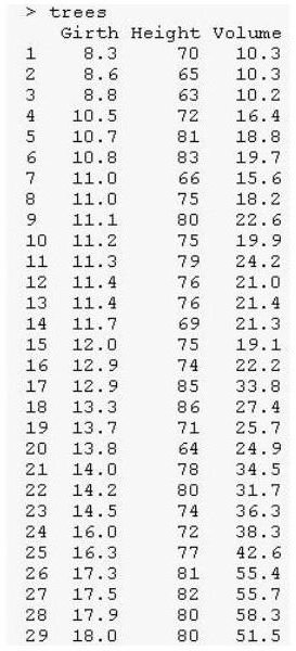
(View the sample tally sheet and the related histogram on your left. Click any image for a larger view.)
Nevertheless, certain technological advancements are now in place to take care of the tallying processes up to the preparation of histograms , which make the work less tedious. Still, understanding histograms and their uses rests on the analyst, since it is quite important in today’s business trends and methodologies.
Image Credit: Ryan, T. A., Joiner, B. L. and Ryan, B. F.at Wikimedia Commons
Illustrating the Uses of Histogram for Data Presentation
To explain the significance of using a graph for a large amount of data, a case study is utilized to illustrate data presentation via a histogram.
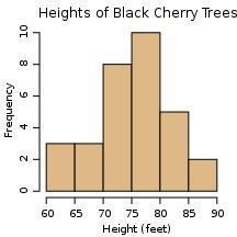
Case Study of Call Center’s Failure for Rapid Response
A call center agency wants to improve its system as an inbound call center and service agency. Although there’s no specific industry standard to which handling of calls should adhere, the agency’s goal is to sustain its ability to respond rapidly to customers’ calls. Currently, the hold-time it takes for their agents to respond has been falling short of the previous track record of less than a minute.
In line with this, a study was conducted in order to determine if the agency needs more staff to attend to the customers. Fifty (50) inbound calls for technical support took more than a minute before a help-desk technician could attend to the customers’ requests for assistance. In fact, it was observed that half of the fifty calls took more than five minutes, which can be gleaned from the following data gathered during the course of the observations.
Number of Minutes the Customers Were On Hold
- 0-1 minute = This is the rapid-response time by which phone calls should be answered.
- 1-2 minutes = Two (2) customers had hung up their phones.
- 2-3 minutes = Five (5) more customers had hung up.
- 3-4 minutes = Eight (8) customers also gave up on holding.
- 4-5 minutes = Ten (10) customers stayed on the line and were attended to.
- 5-6 minutes = Another set of (10) customers who waited while on hold, had been given assistance.
- 6-7 minutes = Seven (7) more customers had been provided with technical assistance.
- 7-8 minutes = Another set of four (4) customers waited for their turn to be served.
- 8-9 minutes = Three (3) of the customers simply gave up and decided to hang-up.
- 9-10 minutes = One (1) customer’s patience paid-off and he was finally served.
Now if you are to study the data presented above, would you be able to perceive with relative ease, the implications of the data presented?
Not quite, because it’s a bit difficult to focus and delve into words and numbers at the same time to visualize a larger concept. This is now where the histogram comes in as a useful and practical tool.
Data Presentation With the Use of a Histogram
At a glance, the data for the 50 customers who had waited beyond the rapid-response time, can be gleaned through the use of a histogram. Planners can readily perceive that the hold-time for the calls can even last up to 10 minutes before they could be attended to.
By this simple graphical presentation, it communicates information to a project team that there really is a need to improve the agency’s call-handling systems. Otherwise, the agency is bound to face potential problems if this trend is allowed to continue or get worse.
What other inferences can be derived from the histogram?
Proceed to the second page in order to find out how histograms can be used for analysis.
Image Credit: Histogram for case study on Call Center Hold-Time was created by the author for this article.
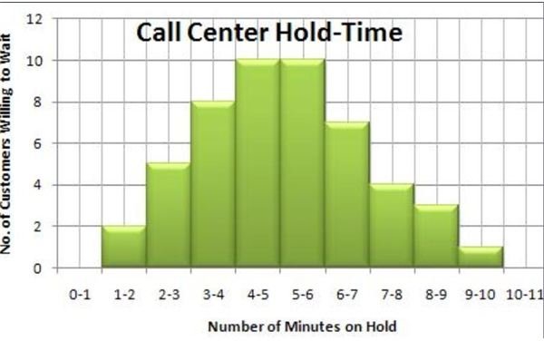
The Histogram Shape of Distribution and What it Tells
The graph can be taken further by connecting the end points of each bar for purposes of plotting the distribution shape. View the histogram image and notice how the top ends of the bar were connected by lines to determine a trend.
The distribution shape achieved by our histogram is bell-like, which denotes that the statistical data is in proportion based on the specification limits.
From here the following information can be readily extracted :
-
Half of the customers were observed to have waited for 6 minutes or more. This can be easily arrived at by adding the number of customers who waited between 5-6 minutes through 9-10 minutes: 10 + 7 + 4 + 3 + 1 = 25 customers which is also equivalent to half of the 50 customers observed.
-
Two sets of data had 10 counts each and both groups waited between 4-5 and 5-6 minutes. This could be taken as the mode or an indication that these customers regarded it as the norm at this call center agency. Perhaps they have been through this as a routine and somehow expected the availability of the service any minute.
-
These are only inferences but the project team would also have to consider analyzing the technical problems being encountered by the technicians. There is the possibility that an alternative solution for improving the system is to add a special line for those who need quick-fix solutions in order to decongest phone call traffic.
Image Credit: Histogram for Call Center Hold Time with Trendlines was created by the author for this article.
Understanding the Parts of a Histogram
Learning about histograms also requires an understanding of the chart parts.
Title: The title gives a brief description of what the information aims to depict by way of graphical presentation using the histogram.
Horizontal or X-Axis: The horizontal or X-axis shows you the range or the values of gaps in between variables. They are commonly called class intervals which represent or summarize large data sets.
Vertical or Y-Axis: The vertical or Y-axis represents the range values of frequencies or the number of times that the class intervals occurred.
Bars: The bars represent the object, item, event, or person from where the variables arise. Their height denotes their respective frequencies, while the bar placement along the X-axis indicates their respective interval values. The width, however, is the same for all bars.
Legend: The legend identifies each bar and the characteristics of their distinctions or the information for which they stand.
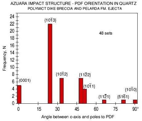
Image Credit: Prof. Kord Ernstson for Wikimedia Commons
Summary:
A histogram is a graphical method of presenting a large amount of data by way of bars, to reflect the distribution frequency and proportion or density of each class interval as a data set. Since a histogram provides planners and analysts with information presented in a compact and organized manner, it allows them to perform the following:
- Analyze a large data set without having to delve in to word descriptions for purposes of distinguishing each variable and their frequencies in a given set of intervals.
- Facilitate the comparison of process results with specification limits.
- Instantly communicate information about variables; their values and their occurrences.
- Make informed decisions based on data analysis.
The best way to hone your understanding of histograms is to learn how to construct one. Read a related article entitled Construct a Histogram in Microsoft Excel 2007 , and from there you can find more resources for learning about histograms and its uses.
Reference:
- Histogram Interpretation: Skewed (Non-Normal) Right: Engineering Statistics Handbook, https://www.itl.nist.gov/div898/handbook/eda/section3/histogr6.htm
This post is part of the series: Histograms for Beginners
This series, Histograms for Beginners, explains histograms from the history of their development to their current usage.