To ensuring Quality Assurance and Quality Control, you must involve the use of several quality control tools and techniques. Read more about these tools that are relevant for the PMP certification.
The Perform Quality Control process of the Project Quality Management knowledge area has several quality control tools and techniques that are also used in the Perform Quality Assurance process. The quality control tools and techniques discussed in this article are:
- Cause and Effect Diagrams
- Control Charts
- Flow-Charting
- Histogram
- Pareto Chart and Pareto Analysis
- Run Charts
- Scatter Diagrams
- Statistical Sampling
- Inspection
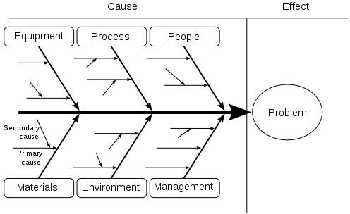
Cause and Effect Diagrams
Cause and Effect diagrams are also known as Ishikawa or Fishbone diagrams. These diagrams are used to identify the root cause(s) of potential or existing problems. An example of this quality control tool is shown below.
Apart from being used as a quality control tool, these diagrams are also used in risk analysis.
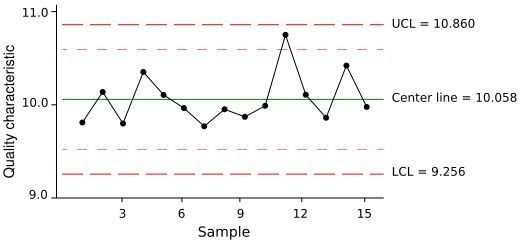
Control Charts
Control charts are used to illustrate the stability of a process. This quality control tool gauges the behavior of a process over time. If, during the recorded time, process shows unacceptable variance, the process is deemed unstable. Unacceptable variance would be a process that shows seven consecutive readings above or below the central line. The upper and lower limits are also set for the process and are usually at 3-sigma.
Flow-Charting
Flow-charting requires you to follow the flow of a process to determine potential or existing problems in the process. You can use this quality control tool to predict potential flaws in a process.
Apart from being used as a quality control tool, these diagrams are also used in risk analysis.
Histogram
A histogram is a graphical representation of event frequencies. This quality control chart is also known as a column graph.
Pareto Chart and Pareto Analysis
The Pareto Chart shows the Probability Density (depicted by the blue line) and the Distribution Function (depicted by the red line). The probability density is the probability of the occurrence of a variable. An example of a Pareto Chart is shown below.
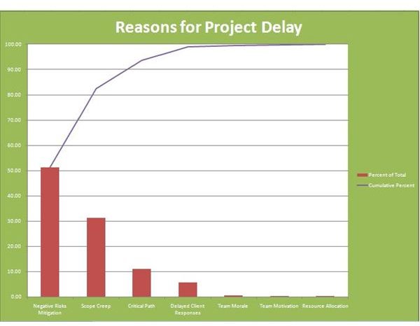
Read the The Relationship between Pareto Distribution and Pareto Principle article to see how the Pareto Chart shown above is used to improve project management processes.
Run Charts
A run chart is a series of recorded data over time that is graphically represented. This trend will help in understanding whether there is a problem or not. The following diagram gives an example of a run chart.
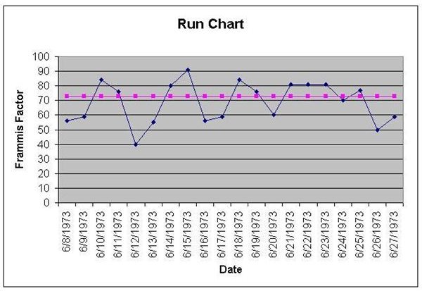
Image source: Wikipedia
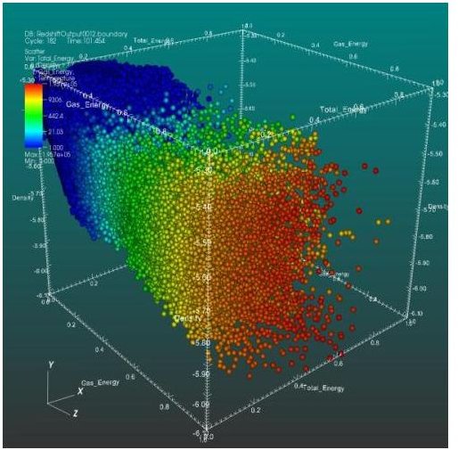
Scatter Diagrams
A scatter diagram shows the correlation between two variables. Scatter plots can show the relationship between two parameters. For example, you can use Scatter Plots to understand whether there is a relationship between team attrition and working late hours.
Statistical Sampling
Statistical Sampling involves measuring a portion (sample) of the entire population instead of measuring the entire population. This can save quite a bit of time. For example, if you have to inspect 10,000 units a day, then it would take forever to complete the activity. By sampling, it takes much less time.
Inspection
Inspection involves reviewing the product to see if it meets the defined quality norms. Conducting reviews is an example of inspection.